Picking a color for interior spaces, as you know can be very stressful. Where do you start? Well, there are a million places to start but my favorite starting point is with inspiration photos I loved and pinned on Pinterest. I find so much inspiration from travel spots far and wide. From the icy lakes of Iceland to the sculptural mountains in Sedona; I always gravitate toward desert landscapes for neutral tones and waterscapes for cool blue tones (that’s the Pisces in me). One of my favorite apps for choosing paint based on a photo is Benjamin Moore’s Color Portfolio. Once you click on color capture from the menu you can upload a photo and it will pull recommended colors for you so you don’t need to tirelessly search through their library of 3,000+ colors!
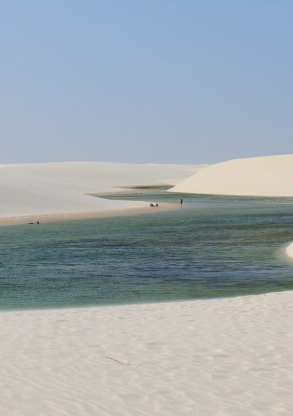
Right now I’m so inspired by this photo I grabbed from Pinterest of the Andorinhas Lagoon in Brazil. These light watery blues and greens and the tans and whites from the sand dunes. I plugged this photo into the app and I initially got…


I love the suggestions from the app but the best part…if you don’t like your initial results you can touch the photo in a different area for other paint colors. Once you get a few that really speak to you consider ordering some samples to try or if you’re more daring order a full gallon and commit! Try to pick inspiration images with lots of different color variations to get a wide range of suggestions. Check out the other color suggestions I got from the app… these are just a few!
Happy decorating!
xo, Chenise Elida

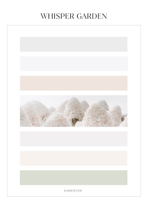
- Aberdeen Green
- French Canvas
- Forest Valley Green
- Snow on the Mountain
- Del Mar Blue
- Lakeside Cabin
- Calypso Blue
- Apparition
**This post may contain affiliate links, meaning when you click the links and make a purchase, we receive a commission at no cost to you. My opinions are 100% my own.